Yamato Transport (aka Kuroneko Yamato) is well known for its black and yellow logo of a black cat carrying a kitten.
The “Kuroneko” mark, which means safe and courteous, has remained unchanged since it was established in 1957, and has become a familiar symbol for people in Japan.
First Logo Change in 64 Years
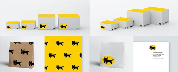
The Yamato Group designed a new logo, which will be used for Yamato Transport from April 1.
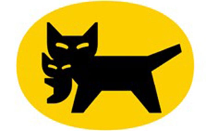
Wait a second…isn’t that the same as before? you might have wondered.
It is hard to tell at a glance how it has changed from before.
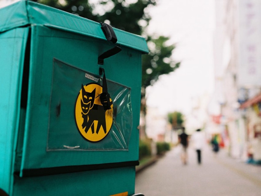
However, if you compare it closely with the mark in the below photo, you can notice the slight changes.
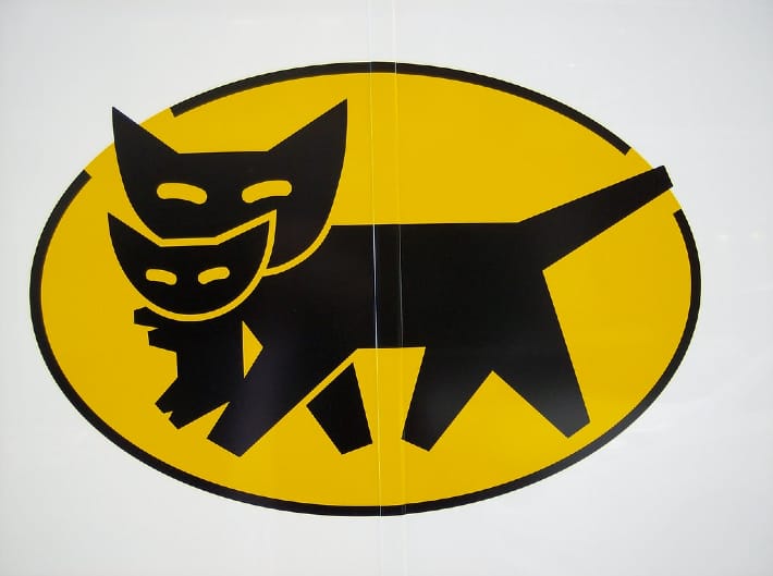
The black border around the logo is gone, and the cat now has two legs instead of four.
According to Yamato Transport, the new logo has been refined to be more “future-oriented” that “expressed our intention to further evolve the services that we have been providing day in and day out, while harmonizing and blending in better with the environment of cities, towns, and regions.”
In addition to the existing logo, a new “Advance Mark” has also been established.
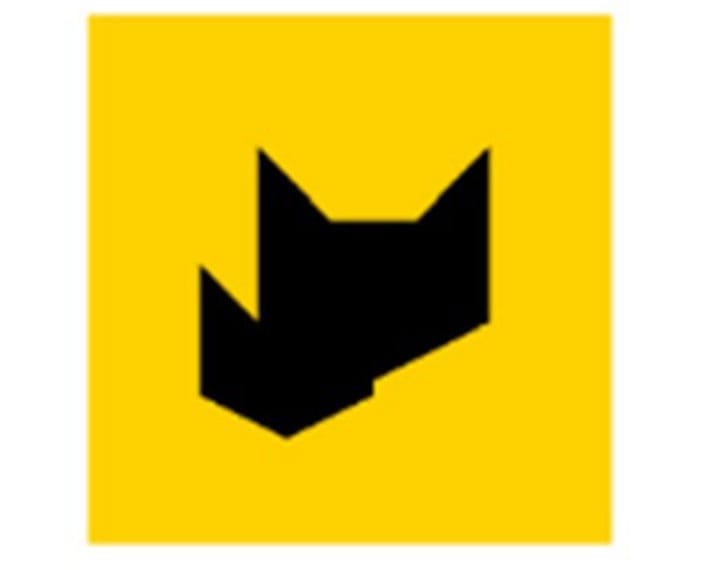
According to Yamato Transport, the new logo symbolizes the company’s vision and stance on taking on challenges in an evolving society, unconstrained by conventional thinking. It will be used when developing new services and businesses.
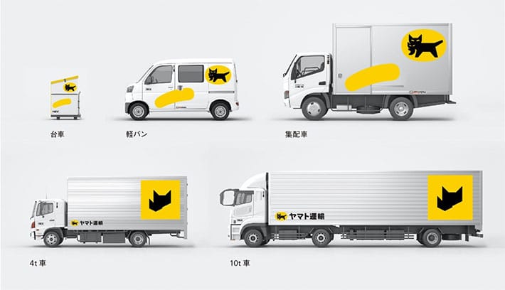
Reactions to the news of the logo change have been mixed. Some say the logo is just fine as it is, while others prefer the new logo.
After 64 years, it makes sense that there’s a little controversy around the symbol change, but as long as the quality of service doesn’t change we’ll all survive right?
Read more stories from grape Japan.
-- Japanese kimono coordinator ties awesome Evangelion-inspired obi knots
-- Help Japanese farmers reduce food waste with curry paste made from imperfect produce
-- Time is running out to save one of Tokyo’s institutional burger restaurants!
- External Link
- https://grapee.jp/en/
 Take our user survey and make your voice heard.






28 Comments
Login to comment
HBJ
LOL Is that what they were told by the design company that billed them an extortionate amount for this rebranding?!
I’m in the wrong business!!
HimariYamada
Nice logo.
Robert Cikki
Ah, they have obviously used the Corporate B.S. Generator. Instead of synergistically formulate compelling sprints and appropriately leverage existing world-class quality vectors, they rather went the compellingly leverage existing process-centric methods of empowerment way.
Pukey2
Riveting news.
divinda
Old logo showed a 4 leg cat walking carrying its baby. The cat was in motion.
New logo shows a 2 leg cat standing carrying its baby. The cat is stationary.
Which better represents a Transport and Delivery company?
Verdict on new logo: Fail.
GBR48
It costs a lot of money to change a logo across a corporate entity. Spending the money to make such a tiny change does not reflect well on them. It would have been better to have paid the money as bonuses or a wage increase to staff at a time when many are finding it difficult.
Gooch
Meh, someone important at Yamato company probably has a relative at the ad company that did the rebrand. With ad revenue in something of a slump, what better way for Yamato to support the ad company than to throw loads of cash at it to fix a problem that didn't exist?
Goodlucktoyou
Totally sexist logo anyway. Suggests women’s role is just minor tasks like carrying babies. Low pay, hard work.
i do love this company though, I don’t need ID and when I’m walking with my dog, they stop and give me my products so I don’t have to go to office to collect them. Staff are very friendly.
Toasted Heretic
Cat sell culture.
caninjpn
Some insight as to why this may have changed despite the corporate BS they mentioned:
1) the old logo had the cat's ears and tails sticking out of the yellow background as well as a black border around it. This causes problems when printing stickers, requiring special stencils to be made, or the thickness of the black border being cut off and not look complete.
2) the addition of the 2 legs costs extra for the ink used. It's miniscule if it's for one small print, but for billions of prints, that can cost way more.
3) not making lines to separate the cats could be avoiding small prints from making weird errors print errors because of the finite detail (even at this day and age)
4) the advanced mark feels more like it will be used as a app icon. current app icon uses the current logo with a grey gradient background, with the "advanced mark" it pops the icon more so it's more eye-catching. (I made a comparison in figma)
Here's my two-cents as to why Yamato, like many other companies like M$, Intel, IBM, and others have redesigned their logos.
wanderlust
Cannibal cat - what we used to call them!
cleo
Just my opinion, but I think cats should have four legs.
Especially when they're carrying something as precious as a baby.
Can't quite put my finger on why, but the 'new' cat looks a bit sinister.
As others have said, if something isn't broke, it don't need fixed.
The money would have been better spent on a bonus or wage increase for the excellent delivery staff who do a great job in all weathers and are always helpful and courteous.
Vinke
@goodlucktoyou
how do you know if the cat in the logo is female or male?
kohakuebisu
I prefer the old one. I don't like the advance mark.
The explanation given probably isn't meant to be considered seriously, but If they wanted to "harmonize" with the urban environment, which would a good thing, they would use muted colours, not loud, poster-paint yellow. Ugly, garish, and excessively large signage is just one of many problems in Japan. Yellow and black are a warning in nature, and perhaps it would be better if they were resticted to temporary things like police incident tape and warning signs about roadworks.
mikeylikesit
@vinke
Because only female cats care for kittens. In real life, a male cat would simply kill the kittens so it could mate with the female cat again sooner.
Of course, if @goodlucktoyou is reading human gender roles into cats, that’s another whole messed up problem.
Do the hustle
the new logo has been refined to be more “future-oriented”
Refined to be easier and cheaper to reproduce.
ganjaplant
At least the cats name isn’t sambo. My grandmothers cat was named sambo. I found many years later what sambo was. I was like omg grandma!
kurisupisu
I have the book and it is a beautiful story and my black cat approves of the new logo with a disdainful yawn...
Dango bong
how is a two legged cat more advances than a four legged cat? stupid
oyatoi
The redesign of the mother’s and kitten’s face/head, and four visible legs reduced to two is less troubling than the loss of suggested mobility inherent in the old design, with its black border pierced by the feline’s ear and tail, and the legs in motion.
Desert Tortoise
Caninjpn nailed the answer. The new logo simplifies printing and reduces cost. Yamato Transport couldn't say that out loud so they came up with a nice sounding story to explain the change.