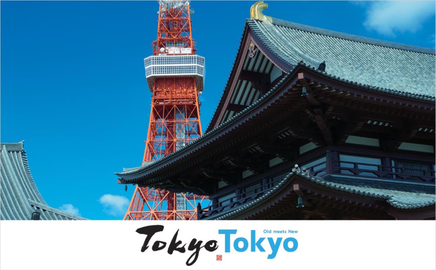
The Tokyo metropolitan government has created a new logo and slogan, "Tokyo Tokyo Old meets New" (the first Tokyo depicted in a brushstroke font and the second in a Gothic block typeface), to effectively convey the attractions of Tokyo overseas. This logo will be used in various promotional activities abroad.
According to the Bureau of Industrial and Labor Affairs, the design presents "Tokyo" in two different fonts in order to intuitively impart an image of the city. The brushstroke of Tokyo and Gothic block typeface of Tokyo represent the originality of the city, where traditions dating back to the Edo period (1603-1867) coexist alongside the cutting-edge culture of today.
The tradition is expressed in black ink, while the new Tokyo is expressed in blue, like the sky spreading forward to express the innovative future. To give some playfulness, the logo also includes a traditional stamp that shows one of Tokyo's newest sightseeing landmarks, the Shibuya scramble crossing.
© 2001-2017 by Kyodo News PR Wire All Rights Reserved


57 Comments
Login to comment
gogogo
Confusing, looks like http://tokyo.tokyo which is a reserved name.
sf2k
If you have to explain a logo or a business name or a domain name then it's not designed
JonathanJo
With luck Tokyo Tokyo will do for Tokyo what Frank Sinatra did for New York with New York New York.
Dango bong
I agree with the premise that Japan is an old meets new country, but I do not think a poorly designed logo will help tourism. Most people know what Tokyo is anyway
jcapan
Am I the only one who thinks the photo is odd? Tokyo Tower itself was completed in the '50s. Not that I'm a fan of any towers but the Sky Tree seems more suitable to the concept. Or a Blade Runner nightscape etc.
Kobe White Bar Owner
At least it has not been pinched from another designer...
smithinjapan
Once again they forgot to ask anyone what they thought before choosing, and have to explain and justify it. How long will it be before this is changed? From now on people will be joking, "I have a business trip to Tokyo Tokyo tomorrow".
Why not the Kanji in old brushstroke and then the serif-sans Roman characters? THAT would make sense. Sure, people overseas may not be able to read it, but stylistically it would be more appealing and make more sense in pounding the "old/new" into our heads. And shouldn't "old" be in brush stroke as well? if that's their rationalization?
smithinjapan
And sorry, but the "beauty" of the old Tokyo Tower is lost on most people, and this just looks like an ugly, red tower behind a nice Japanese temple (and shouldn't they be reversed for old/new?). Bad design, on the whole.
Robert Dykes
I feel like this is the biggest thing most people who have not been to Japan don't realize, the huge juxtaposition of old and new in Japan. But Tokyo?! Tokyo is hardly a showcase for that juxtaposition.
What, a few temples here and there? Asakusa. 9 of the top 10 things to do and see in Tokyo are science museums, massive towers, modern architecture, Odaiba, Akiba, Shinjuku, Harajuku, Shibuya, etc, etc, etc.
Its not even until you leave Kanto completely that you really get a feel for old Japan. I even tell everyone who comes to visit go to Tokyo and one old city because you want to see all the modern stuff in Tokyo and old stuff in a place like Himeji or Kyoto.
taito
>
Alex Einz
weird,and boring design
goldorak
I like the black brushstroke font, not so much the slogan itself nor the photo. "old" still has a negative connotation particularly in a 3 word-slogan. Reckon History/modernity or similar pun would have been better.
Goodlucktoyou
It should say "old infrastructure, new building".
tiger_tanaka
I think the new logo is fantastic. It mixes the old with the new. Our culture is deeply rooted in tradition and history while also emphasizing the modernity and technological advance of Japan. I hope this will encourage more foreigners to come to Japan and learn more about the Japanese culture. I feel so proud to be a Japanese.
Wakarimasen
Absolutely Brilliant!!!!!! I can see this doubling tourism in the coming years....
Oh wait, tourism is already up massively..............
Mike L
Like Tokyo needs to be promoted more!
smithinjapan
tiger_tanaka: "I feel so proud to be a Japanese."
That's the problem -- this was designed by Japanese FOR Japanese by projecting Japanese feelings of how other nations' peoples should feel and think. Like I said, no one who does not know the iconic importance of Tokyo Tower is going to see anything but a rusty orange building, and Tokyo does not espouse the "old and new" like Kyoto or other places do, and this whole "old new" thing is not unique to Japan, either.
jcapan
tiger-tanaka = satire
TumbleDry
Hmmm... "Tradition meets modernity" would be better imho.
Disillusioned
They should have just used the kanji for Tokyo. It would not have looked so stupid.
spinningplates
The tag line should be...'Tokyo. Older than you think.'
Dan Lewis
How about people here make their own designs, upload them and post the links so we can see them?
Jonorth
It's just.. pretty odd, I think. When you haven't heard the explanation, it's just "Tokyo" in two fonts. TokyoTokyo why?
TrevorPeace
I think any of my thousands of photos taken during yearly treks around the country would prove better than the one they picked. And I agree with comments here about the double Tokyo name. I retired from owning an ad agency that could easily have produced a more meaningful message. Japan is a lot more than Tokyo.
jcapan
"Japan is a lot more than Tokyo."
But this is a Tokyo Metro government campaign to promote tourism to Tokyo. NYC doesn't sponsor ads promoting the Dakotas.
Simon Rudduck
Okay. I am a designer working mostly in branding in Australia, but I lived in Tokyo for 7 years. While there I had the best idea for the city's logo, based on the kanji. It's one of those logos that just makes sense. Who do I pitch it to?
If they want it, they can have it in exchange for a simple holiday and a word of thanks. I have no use for it.
smithinjapan
Dan Lewis: "How about people here make their own designs, upload them and post the links so we can see them?"
Would they then be entitled to their own opinions by you? Or should we all just shut up and automatically respect whatever is presented to us for our opinion if we're not going to say only positive things?
jcapan: "But this is a Tokyo Metro government campaign to promote tourism to Tokyo."
I think you mean, to promote "Tokyo Tokyo".
plasticmonkey
Wow! Tokyo is traditional and modern at the same time. Unlike any other city in the world. It's like, so 1964, baby!
BertieWooster
Wow! This is way up there with the old BBC test card! Way to go Tokyo government. Worth every yen of the taxes we pay!
nandakandamanda
The sign is fine in my view, but there is so little left of good old Edo in Tokyo today. Any visitors expecting to find historical places or scenes like in Ukiyoe prints must be shocked. There are little pockets here and there, though, if you dig around.
nandakandamanda
"TOKYO Tokyo, Old erased by New"
Danny Bloom
I love it. I don't understand all the carping and negativity here. It's a very nice design. Quitcherbellyaching!
gogogo
AAgree with most posters they should have used the kanji for the old Tokyo
Disillusioned
The kanji for Tokyo is not difficult and is easily recognisable, even to those with no kanji knowledge. It would have depicted the traditional side of Tokyo much more than recycled English in a common Photoshop font. Or, is it that dicky little stamp in the corner that makes it traditional?
I worked in signs and advertising for over two decades before coming to Japan. In fact, I am 3rd generation signwriter. The graphic designers in Japan are hopeless! Just look at the crap they came up with for the Olympics. It's just a basic 3D block design in a single color. I could have whipped that up in Illustrator in ten minutes! And, let's not forget, their first attempt was just copied! It must be great work if you can get it!
nandakandamanda
zichi, don't forget the rockin n rollin, the real earthquake experience.
Pukey2
A stupid question but why does a city need a logo? It's not like the Olympics or some sort of company.
smithinjapan
plastic monkey: "Unlike any other city in the world"
And don't forget it also has a unique four seasons!
nandakandamanda: "The sign is fine in my view, but there is so little left of good old Edo in Tokyo today."
Precisely! And even as they print this sign some underworld figures are scheming on how to get a homeless person to burn the rest of "Golden Gai" or other "old-Tokyo" spots to make way for a "new Tokyo" department store or condominium.
"TOKYO Tokyo, Old erased by New"
Nice!
Raymond Chuang
Here's the problem with this campaign: almost every building within central Tokyo post-date World War II. There are only a very small number of neighborhoods (most notably Yanesen, which is northwest of Ueno Park and reachable by a short walk west from JR East Nippori and Nishi-Nippori Stations) that survived the firebombing raids, and even these neighborhoods saw a lot of development post World War II. The slogan would be much more appropriate for Kyoto and Kanazawa, both of which have many historic buildings that are hundreds of years old.
Dan Lewis
I honestly don't care if someone makes negative comments about this logo. Hahahaha! It just seems that they must be basing their comments off the quality of their own work. So I'd like to see some.
Shall I post mine?
Blattamexiguus
I suspect the tower may be older than the roof!
never mind that all I can see are some nondescript red girders.
Old what? ...thinking?
new what? ...dumb logo/slogan?
where is the new cute merchantisable mascot when we most need one?
Blattamexiguus
How about a laughing blue fin tuna character?
Eve Aphayboun
This is the best they could do?
DaDude
On my travels throughout Japan these past few years including this past weekend in Okinawa, why do they try to cater to English speakers so much when 90% of the people I see in my hotels and tourists spots are either Chinese or Taiwanese?
FullAttrition
Looks ok, but reads like the name of an 80's pop band.
mmwkdw
So , what makes Tokyo really good as a Tourist attraction anyway ?
Many of the places here are rather boring, if you want a bit of excitement... then perhaps they should promote the Japanese War museum at Yashukan (near to the British Embassy!), it's associated Temple has a lot of followers within the Region, and well, once you've been there, you've seen them all essentially. Temple, Temple, Temple, Teemmpple.. Teemmmpllllee... ... etc
In order to attract the younger generation here, Japan needs to do more to promote some of the more interesting things it has to offer. Skiing, Water Sports, Mountain trekking... they just need to jazz it up a bit.
As to night clubbing... Roppongi used to be the place to be... though since 2000 they've basically shut the place down, its now more than mediocre, so why bother going there ?
socrateos
They did in one of regular press conferences.
https://www.youtube.com/watch?v=CRSf9knf0SA&t=225s
socrateos
At least it does not need a long explanation and "Old meets New" is printed in smaller font right there to give on-lookers an "Ahah" moment.
For more inquisitive kinds, there is another "Ahah" moment in the small red square dot between two Tokyo fonts, a symbol that represents the modern Shibuya Crossing in a traditional Japanese seal style.
kohakuebisu
I don't like it. I don't like the fonts or the composition, which looks unbalanced. The brushstroke part has two letter o's written differently, and the baseline is not consistent. The alphabet part looks like its been selected from the massive offering of fonts that came with Windows 95. The spacing of the letters (kerning?) is also weird, with the first o fitting below the horizontal stroke of the capital T but a large gap being left between the o and the k. I mention these small problems because I suspect they add up to the big problem of the whole thing looking naff.
I think the slogan is good, not because Tokyo has a lot of "old", but that a lot of people visiting the city are so keen to see "old" (and its juxtaposition with "new") that most of them look hard enough find something, even if its just a chance to photograph a woman in a kimono using a smartphone. The old meets new slogan is playing off and reinforcing an image of Tokyo that is definitely out there and succeeding already. The idea that Tokyo has much old compared to a European city is of course highly questionable. Even the Meiji Shrine is only about 100 years old.
Jalapeno
Capitalize the "m" in "meets" or lower the "N" in new. Be consistent.
There need to be more Geisha or Maiko walking around to give tourists photo opps, kind of like those characters in the ratty costumes harassing the folks at Times Square.
gaijinpapa
Tokyo is a nice place to visit - esp when you can take so many trips out of Tokyo.
Better place to visit than to live.
Robin Perez
I also think it's too busy, something simpler would be much better – and go finely with Zen tradition, imo; quickly thinking how the combined parts of names would make a single "Tokyo" easier to stand out, so I gave it a try – later I found other comment(s) suggesting the same thing)
http://designartis.com/wp-content/uploads/2017/05/Tokyo-logo-rpp.jpg
Toasted Heretic
The old meets new thing is just so... old. It's a stock cliche used in a million (exaggeration) and one news reports/articles etc... "Tokyo; where the ancient co-exists with the ultra modern" - yes, we get it. It's not a horrific design nor is it offensive. It just lacks a bit of excitement. And originality; which surprises me as this country is very inventive and innovative.