This is the new logo that will be used by the Japanese government around the world to promote Japanese animation, fashion and food under the theme of ''Cool Japan.'' The logo was created by designer Kashiwa Sato, who has done work for the Uniqlo brand.
© Japan Today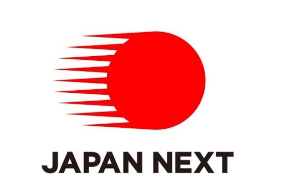
'Cool Japan'
©2024 GPlusMedia Inc.
 Take our user survey and make your voice heard.









90 Comments
Login to comment
Konsta
I would still prefer TOTORO.
paulinusa
I like it. Looks modern and up to date, similar to a corporate logo.
gaijinfo
Japan: The Disneyland of the world
ben4short
Far from cool rising sun logo for a far from cool culture. "Japan Next?" Dasai.
Konsta
Japan is fine and its culture is also nice. The logo, however, evokes associations with a melting reactor about to explode. I would really stay away from anything that may give even a hint of that.
nath
I'm not so crazy about the logo or the theme either. Looks like something on a B list. In fact, many Japanese corporate logos look second-rate in my opinion.
some14some
"Japan fencing gates" - nothing cool about this logo.
sillygirl
time and money could be spend in better ways. there are people still without homes and proper food.
JeffLee
The English words don't resonate nor make much sense. But if it was concocted by non-native English speakers, as is usual in Japan, then the decision-makers got what they deserved - a muddled and mediocre result.
Nicky Washida
Well, look on the bright side - at elast it doesnt feature an inane sycophantic cartoon character. And it defintiely was cococted by a native, otherwise it would read "Japan Rets Nexting"
Serrano
The spikes should be on top of the ball, and they should put two eyes and a mouth on the ball.
LHommeQuiMent
Another Hinomaru variant.
JeffLee
And it defintiely was cococted by a native,
I suspect it was "checked" by a native English speaker, and the people who actually decided on it lacked the ability to judge its effectiveness. Yet another reason why Japan is losing traction on the world stage.
shirokuma2011
A meteorite burning up as it enters earth's atmosphere??
Seawolf
My first thoughts as well went about those lines that something is burning there, sun storms, earth nuclear meltdown; it definitely does not look like something speeding, and with that text it looks ハンパ, half-hearted
combinibento
For a country known for its innovative video games and modern entertainment technology, it is an interesting choice to go with a good old pinball for their logo...
Ivan Coughanoffalot
Oh, a hinomaru with go-faster stripes. How extravagantly imaginative. I wonder how many tens of millions of our money was spent on our behalf for this, and which government crony is mates with Kashiwa Sato?
Foxie
I was thinking about a meteorite as well. The logo is nice itself but maybe not to represent animation, a gasoline stand maybe.
nath
It is an epicenter and tsunamis
smithinjapan
I like the simplicity of it, but I don't think it's appropriate for trying to PROMOTE Japan. It looks like it might be a symbol for the Japanese nuclear energy agency, or for a campaign to end global warming, but not to sell products. The first thing I saw when I looked at this was how they still can't secure the Fukushima plant. .
smithinjapan
That or it invokes the 'hinomaru' (or Japan), in radioactive decay.
papasmurfinjapan
Well it's definitely "Japan", but it ain't "cool".
TokyoTanuki
It looks like a fireball from the video game StreetFighter.
Also a bit of a strange choice of words since there is already a company called SBI JapanNext, which is well known in the Equity trading business here.
warnerbro
It's a molten ball of nuclear fuel emitting radioactive particles that are blowing towards Tokyo. Perfect. But where did they get the Next part? A Pepsi commercial?
Konsta
The problem with "Cool Japan" is that I never can tell whether 'cool' is a noun or a verb??
Christina O'Neill
I dont understand why they used the caption, JAPAN NEXT,,,Next after who?
papasmurfinjapan
It's a typo. They left out the question mark. Japan? Next!... my odds are on South Korea.
LockOn
I don't mind the fireball logo mark but the logotype definitely looks like an after thought. It's a challenge to design interesting logotypes in a language that isn't your native.
Ed O Jidai
It looks like a weapon women could keep in their hair.
Bluebris
It makes me think "Hadouken." It does not make me think "Cool Japan."
2020hindsights
Japan Next is also the name of a company in Japan. I wonder if they will sue.
cactusJack
That comet is heading right for us!
BoratLikeBarry
Are they trying to copy "Cool Britannia"?
hatsoff
I'm sure there's a lot of BS that goes on when a designer pitches his design to the decision-makers, along the lines of "It symbolizes this, and symbolizes that...". The decision-makers went for the concept, not the final design.
cleo
It looks like the hinomaru is hightailin' it outta here.....
Not good.
gogogo
They reboot this every 18 months, they throw a bunch of money into it then walk away.
HumanTarget
If you look at it from right to left, it looks like a claw of some kind.
kaomoji
Wow, animation is the last thing I'd think about when I look at this. Boring.
Noripinhead
"Japan Next" .Yeah, could be taken as a threat. Next on the list as a target.
mokgohan
Kind of a cross between Mastercard and The Detroit Red Wings. I don't envy the designer, Sato's job- whatever he presents, people are going to see Fukushima in it. Maybe this time they should have gone with a simple outline of the country in solid white on a red background. Dou?
NeoJamal
Mentioning Britannia, that Code Geass anime should have never left these shores.
Ivan Coughanoffalot
Cool Japan? Oh yes. Because sitting at a desk for 14 hours a day, pretending to work, is so cool. The girls go wild for them hep cats scared to have or express an opinion on anything, other than to agree that something is cute or delicious. It's ubercool to have a media that treats you as having the discernment of an infant. Look at the colours! Look! That lady shouted! See! His did a funny face! And the hallmark of James Dean cool is not even having the gumption to make love to your wife and breed.
Who do they think they're fooling?
Utrack
looking at the Logo from right to left it Looks like my afro hair pick when I had an Afro.
chottomatte
Tech note: this should've been a PNG, not a JPG, hence it looks a bit crappy on the red.
What happened to "Let's Japan!"?
Yes, another himomaru. There are plenty of good designers in Japan, but I wonder if that red circle is in all the scopes. I've loved living here, but watching the country lurch from tired idea to tired idea to another tired variation on a tired theme is getting to its limit now. I thought the quake might jolt people (so to speak) to re-invigorate themselves, but things like this, one week ministers, and the dropping of setsuden met with the usual waste, justifies those who believe that whilst Japan will move on and up, days of interesting new developments are waning.
櫻井 宏幸
The logo is cool for me, Go Japan, Gambare Nippon! You can do it......
ItsMe
You seriously must be kidding. The navy flag used to promote anime? This will go over just as well as the Mori building in Shanghai.
TokyoGas
Another hinomaru clone... They really should be able to do better than this.
kaketama
I like anime and manga, but I never want the government to promote such things. The prosperity of subculture, I think, predicates the freedom of expression,anything-goes world. Intervention of the government has the possibility to spoil it. Anyway, this logo is not good looks and I feel it a bit awkward to call themselves "Cool."
nath
I reminds me of AT&T logo of America. Therefore, I don't find it cool. ^^
some14some
Now its pretty clear that international community (JT readers from various parts of the world) has rejected this logo...so govt may use it for domestic purpose and make a new logo for overseas.
TheQuestion
It kind of looks like the typical red sun is moving really fast. It keeps the sun but adds some flair to it.
It's not the re-branding of the century but at least they're giving it a go. I remember when all my co-workers in the States used to fight to sublet my apartment during the 8 months out of the year I was either in Europe or back in the U.S. The interest has really died down and considering how vibrent the culture is it's kind of sad both for the lack of tourism to a truely lovely nation and the fact I'm not making money off sub-letting anymore...
It took me years to get that spot and I'll be damned before I have to go back to the flat my company maintains.
IronBeard
HADOU~~KEN!!
IronBeard
OR, METEOR!
So, Japan is now officially a combination of Street Fighter and FFVII
About time :-)
anglootaku
Looks so 80's, looks good
Tamarama
Japan IS cool, and I don't mind the logo. But at the end of the day, no logo is really going to fashion my thinking in terms of visiting Japan. It rests on a lot more than that. And Japan's got PLENTY.
BlueWitch
@櫻井 宏幸
EPIC FAIL!
darbysan
Japan going ahead super fast
ChopriCana
Sato Kashiwa should be able to create better than that... Did he really design this Logo? I wonder...
BlueWitch
@JeffLee
The English words don't resonate nor make much sense. But if it was concocted by non-native English speakers, as is usual in Japan, then the decision-makers got what they deserved - a muddled and mediocre result.
EXACTLY!!
patty cake champion
I thought this was a bid to increase awareness for the game of cricket in Japan.
Some of you mentioned about getting the 80s vibe from it. That's good, late 80s Japan was awesome. GET WILD AND TOUGH!
Aakmal999
come to Japan and playing volley balls?
LoveNot
I absolutely love this logo, it is to the point: a ball/sun moving/flying to the future at great speed and leaving traces. It could be a taiko drum, meaning keeping the traditions. It could be a bullet straight in the target. The message is traditions, innovation, speed. The logo is simple but say everything. Great job!
Konsta
Actually, the UNIQLO brand is made quite stylishly. Look for yourselves: http://www.uniqlo.com/jp/
Simple and clear forms with no association to comets etc., good sentences like:
"Made for All"; "We are Style"
Maybe the guy should turn to what he did already. Here the idea is to promote "Japanese animation, fashion and food". Neither "Cool Japan", "Japan Next" nor the logo itself do promote those things, but all have the Japan as a state thing. Maybe some more relevance is needed to the current goal. Something like:
"Japanese style. Made for the world";
"Japanese culture. Made for the world";
"Made in Japan. Made for the World", or something along those lines.
gaijintraveller
Konsta says: The problem with "Cool Japan" is that I never can tell whether 'cool' is a noun or a verb??
I would tend to think it is probably an adjective in this context.
Cool Britannia had a ring to it as it rhymes with Rule Britannia, which is the name of a song. Apart from not being very original, "Cool Japan" just doesn't hit the mark. Other Asian countries seem to do somewhat better in their choice of slogans.
Johannes Weber
All reviews with foreigner's opinions of which part of modern Japanese culture is cool presents toilets as the best aspect of modern Japan. So let's try "Cool Japan" with a toilet as the logo. Then the "Next" starts to make sense. Everyone who has been queuing at the toilet for a while really appreciates when he moves one position towards his desired destination.
Lieberman2012
People get so worked up about logos here.
Virtuoso
I'm sure when the news finally gets out of how much the government paid for this piece from a 5th grade art class, you'll get worked up as well. Couldn't be less than 30 million yen.
sunhawk
the gov't promoting animation?
oh irony thy name is hinomaru. that dinosaur that runs Tokyo ishihara hates modern Japanese culture with a passion. he much rather have everyone read his books about forcing your gentleman's vegetable on to some poor woman.
sctaber56
Maybe the Powers That Be were thinking along the lines of "Cool Down, Japan" rather than Hip, "Groovy", Cool Japan. As for toilets and foreigners, I'm sure I'm not the first to put forth the idea that aggressively marketing Washlets to the aging nations in the West could very well be the answer to Japan's economic woes. It's fairly common these days to find a box of diaper wipes within arm's reach of the toilets in the homes America's senior citizens these days in an attempt to be "fresh". I think there are thousands upon thousands of folks who'd be absolutely thrilled to have their own Washlet and would pay big bucks to be a proud (and cleaner) owner!
nightvision
If JAPAN NEXT, what First?
Seriously, the logo is dynamic. However, why focus on just animation, fashion and food? Why not compete head-on with Korean consumer media (K-Pop, TV dramas, films), when Japan obviously can offer better material?
ojiiu812badboy
Ivan Coughanoffalot
How do we go about finding out the price tag for this simplistic garbage? We're paying it, after all - shouldn't we be told?
Ooops, excuse me. I confused this place with a democracy again. We taxpayers get what we're given by our masters in this feudal kharzi.
Konsta
There were several suggestions in this thread including China and Chernobyl. To your serious comment, I think Japan is doing right. Japanese animation, food and style is what is popular in the rest of the world, and thus, can bring profits. J-Pop has no chance in Europe, absolute nil, music- and costume-wise. TV dramas stand better chance, but need to be properly translated and dubbed and there is a HUGE competition in that department. And here, in Europe, we have absolutely no idea what is Japanese cinematography. So, the choice is right. But the LOGO is utter crap.
ExportExpert
can only do so much with a large red dot and all of what can be done with it has been done before.
They need to think outside the red dot.
cwhite
✔sha in red would have be better..... oh, was there a company who already uses that logo? and a variety program?
mimitchy
the French do, and their tastes are crap even by Japanese standards.
CrazyJoe
It was former Prime Minister Aso's idea to export anime overseas. The DPJ was fiercely opposed to the idea and now this.
oberst
The spikes should be 45 degree pointing up to symbolize Japan on the way up again. Spikes at the bottom won'r work so well since the logo will resemble a big fat red jellyfish.
Fadamor
Isn't "Cool Japan" a TV show on NHK?
The logo looks like one for a dodgeball tournament, to me.
Stephen Jez
Wow, the designer sure did do some work on this huh? Add some lines, done.
hh1974
Id like very much!!! GO Japan
Patricia Yarrow
Agree with oberst. And, why doesn't it say "Cool Japan"? "Japan Next" sounds to me like, "Japan, next" and out the door.
BlueWitch
@hh1974
Go where? 地獄? HELL? 笑わせるな!
The overused Hinomaru is getting old and tasteless...can't they come up with anything better? I mean, seriously? Oh wait! It's our corrupted scum government behind this....can't imagine how many dirty otaku and lolikon were involved in this BS. YUCK~
soldave
Konsta - There were several comments, although I think only one has been allowed to stay.
Raymasaki
@ itsme. LOL! what? thats NOT the JP Navy Flag! Geez people Get REAL! its just a logo, NOT the actually Flag of Japan they are changing. don't like it Oh well, they chose it & wil use it. i don't think they will care about anyones approval.
tokyo-boy
I think this new logo is great!!
ChopriCana
This logo is very similar design to the one (the Second Emblem) from JOC.
http://www.joc.or.jp/about/emblem/
This Second Emblem of JOC was actually designed by Junko Koshino.
Did Kashiwa Sato copied from her design ???
Konsta
This is the same logo! I think government must get a refund.
Elbuda Mexicano
I think this is about as cool as that idea over in the UK to come up with Cool Igirisu?? It is just not cool, and if you have to FORCE people to think that something is COOL?? So how cool can it really be?? Did Bruce Lee need anyone to go around and say, he Bruce is cool?? Did The Fonz from Happy Daze need PR to let us know he was cool?? Did THE KING, Elvis Presley need people coming up with funny icons to let us know how cool he was? How about MJ?? Michael Jackson need somebody to let us know if he was cool or not?? So if you need a government to let others know your country is COOL, well you must be a dork, a nerd, a wanna be right??
twiceblessed
Not a fan of the new logo.