Officials and athletes wave as the Tokyo 2020 Olympic and Paralympic Games emblems are unveiled in front of the Tokyo Metropolitan Government Building on Friday night. See related story here.
© Japan Today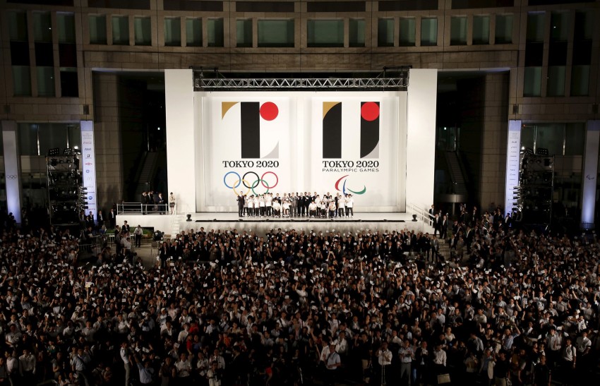
Olympic emblems unveiled
©2024 GPlusMedia Inc.


42 Comments
Login to comment
Nobusaki
Looks great! I love the minimalist design
wildwest
If you turn your head side ways the Paralympic Games emblem is an = sign.
M3M3M3
And what does the "L" stand for what? Or is it just half of Mt Fuji? I think it looks pretty bad, but so did London 2012.
dbsaiya
Nice, but I saw on the news that they may have to use facilities in other prefectures, so it should read, Tokyo/Yokohama/Saitama/Chiba Olympics!
Alistair Carnell
The emblem is based on “T,” standing for Tokyo, tomorrow, and team
With only five years to go, and a main stadium design not chosen yet, I'd say it stands for 'Tits up', which is where this is all heading.
Supey11
@M3M3M3 My guess is that its not suppose to be an "L", but rather when the bottom wedge (which probably is the iconic Mt. Fuji with the sun above) and top wedge are both used with the central rectangle it the reads as a "2". Therefore when combined with the red "0" it reads "20" or "2020".
philly1
Love it. Bold. Unforgettable. Symbolic in multiple ways. Brilliant design.
M3M3M3
@Supey11
Thanks for pointing that out, I think you're right. but it's all a bit too cryptic for my taste though!
Elizabeth Heath
Ooo, they've got a logo. Whoop-di-do.
No stadium though.
harvey pekar
Personally, I don't find the design that inspiring. I would have loved something like Hokusai's Great Wave off Kanagawa, a wood block print style, would've been more beautifully and oddly enough more lively than this cold modern look.
Supey11
@harvey pekar -though one might interpret the bottom wedge as a wave (though its probably Fuji), wouldn't you say Hokusai's Great Wave is a bit of an ominous piece for such an event, not to mention the image of the Tohoku tsunami it evokes?
danalawton1@yahoo.com
J League like.
crustpunker
Looks great! I'm certain that 3 years after the 2020 olyimpks, everyone will still remember the bold, symbolic and lnspiring look of a capital "T" and the...other one!
harvey pekar
Hi @supey11!
I don't mean just reprint the work, but a design in the ukiyo-e style. Great Wave was just an example I gave.
But yeah, threatening or active, dynamic, and or aggressive is better than this logo which resembles a 1970s video game, or as others have mentioned, resembles the J-League logo.
"Designed by the Japanese artist Kenjiro Sato, the emblem "reflects the vibrant nature of the city and the welcoming spirit of its citizens," says International Olympic Committee Vice-President John Coates."
There's nothing vibrant or welcoming about this design.
smithinjapan
I like the five ring design on the right hand design, but the rest of it is only so-so, and open to many interpretations. I'm just wondering if they'll inflate the costs of printing then scrap the design for something else.
sighclops
Refreshingly simple. Curious about the colour scheme!
therougou
blah
badsey3
There is not one without the other type of design. White or black. Between the Sun and Earth (Mountain). They are one (whole).
clamenza
The 1980's Soviet-style building in the background does this image no favors
sf2k
If it didn't say Tokyo 2020 on the bottom what would you see? Given the ugly concrete facade behind it, it doesn't improve the look so I don't really know what to make of it
nath
Don't wanna' sound morbid, but the one on the right makes me think of the WTC on 9/11. Interesting logos, though: very simplistic as others have mentioned. Some logos in the past were just too "busy"...
M3M3M3
I agree with sf2k, without the words Tokyo 2020 nobody would ever guess what this was about. I would have preferred something more along the lines of a Cherry blossom or a Tori gate or anything more instantly identifiable as being Japanese. Let's wait to see what monstrosity of a mascot they come up with.
wontond
They look rather generic and not very Japanese.
Maria M
It looks like some kind of tobacco brand logo... (which given Japan, I guess it fits?)
warispeace
Shouldn't the design blend the logos of some of the big multinational companies that will make money off of these corporate games?
GW
Kind of interesting but as another said very cryptic, without knowing it was for the Olympics I would have NEVER guessed it was for the Olympics.
OH & look at all the govt employee's out front!!
sf2k
Not a happy logo. More appropriate for a jail? It's confusing
Joshua Degreiff
So we have "í" and "u" ok...
This is a good moment to sing Sesame Street song!!!
What words we can find with the letter "i" IMF, Imperfect competition, Inequality, Inferior goods, Inflation target and Intangible assets. Good Job Kids!
Now what words start with "U" Uncertainty, Unemployment trap and Unemployment Good Job Kids!
What we learn today?
Japan is going down!
savethegaijin
The logo they used when they were just a candidate city was so much better.
On television they keep showing people saying how much they love the logo but everyone I know in real life hates it. Pretty much everyone I know (aside from my elderly in-laws) thinks that it's cold and too simplistic.
I wouldn't worry though, in a couple years they'll scrap it and start from scratch.
Apolitical
So to conclude - this is more or less how I see this logo and probably - how I see Japan myself. But - giving the nature of personal observations - they are always one-sided and I'm sure lot of people can say something totally opposite to what I wrote and prove it.
SenseNotSoCommon
Meanwhile in a parallel universe near Shinjuku, an interrupted archer's dream for the precious Rings emblem:
KevinMcgue
The one on the right is supposed to be an equal sign, expressing equality for the Paralympic games. While an equal sign can be written that way in vertically written Japanese text, in most of the rest of the world, it is two horizontal lines. Nice job making an international symbol.
Yubaru
Guess he never rode the trains during morning rush hour!
mistie710
After the ridiculous "Lisa Simpson doing something unspeakable to Homer" icon of 2012, this is certainly a refreshing change even if it is a relatively simple design (the simplest designs can sometimes be the most memorable). As for all the stadium comments, I still agree that ditching the original design and its atrociously out-of-control budget was the way to go.
Shanique Smith
Wow!! Black is truly a striking hue. Such a striking yet simple emblem. Truly the best Olympics' emblem I've seen so far. Good work Japan.
supercub
It's great. People who think it doesn't look very Japanese clearly don't know a thing about Japanese design. That emblem is absolutely quintessentially Japanese in its aesthetic.
Serrano
"If you turn your head side ways the Paralympic Games emblem is an = sign."
If you turn your head sideways withthe top of your head going from 12:00 to 3:00, the Olympics emblem on the left is a person with a red head, a big black arm and an orange foot.
gogogo
T II (ala T2) the new name for the stadium that will cost more than the first one
NathalieB
Well thank God for that. I was half expecting a cute blue hamster on acid.
Yardley
You'll never please everyone with the design. By the way, if the Paralympic Games are equal, why do they have to have a separate logo? Can't they share the same logo? It's the Olympics, for everyone. Just curious.
therougou
And absolutely a rip-off. http://kotaku.com/the-rip-off-controvesy-over-the-tokyo-olympics-logo-1720796383