The requested article has expired, and is no longer available. Any related articles, and user comments are shown below.
© AP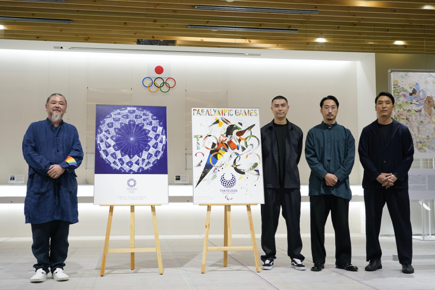
Olympic, Paralympic posters
©2024 GPlusMedia Inc.
The requested article has expired, and is no longer available. Any related articles, and user comments are shown below.
© AP


10 Comments
Login to comment
tamanegi
Nice work gentlemen!
Tom Gill
The cool blue sphere is nice enough, but I far prefer the explosive energy of the Paralympic poster. I want one!
Tom Gill
A spot of Kandinsky influence in there maybe?
snowymountainhell
Agreed @TomGill 9:02am, a reversed and flipped Kandinsky “Composition VIII, 1923”. -
Nothing that original. ‘Explosive’, the energetic shapes and colors were popularized & converted into posters during the 1960’ - 70’s vinyl record store boom and also influenced 80’s fashion, Benetton, Nagel, Duran Duran, etc.
snowymountainhell
While the blue sphere is again evocative of traditional J designs, it still, by no means subtly, panders to the favored styles preferred by “the Triad”: the IOCLDPJOC.
It is also derivative of a Chuck Hoberman isokentic structure. Similar to a child’s expanding geodesic toy sphere, these ‘spreading’ images also need to be ‘retired’ as they are too much reminders of the ‘corona’ scourge inadequately handled by the same IOCLDPJOC over the last 20 months.
snowymountainhell
One humble opinion: ALL of these designs are very similar to the colorful “blooming irises, celebratory ‘crackers and cones’, sunburst fireworks and thread-ball motifs” first submitted by the now disgraced yet, previously awarded Tokyo2020 selectee Kenjiro Sano:
https://www.tokyoweekender.com/tag/kenjiro-sano/ -A question: Did the IOCLDPJOC retain the ‘exclusive rights’ to all previous submissions, awarded or not;
or, did ‘rights’ return to the ‘original’ designer?
Tom Gill
You make some excellent points, snowymountainhell. Indeed the blue sphere is not a good choice for these pandemic times. Not only does it have that spreading feeling that you mention, but also it bears quite a strong similarity to a close-up picture of a Coronavirus. That is due largely to the fact that it is so very similar to the official Olympics logo, pictured right below it on the display board… so similar as to make one wonder what the point of this new image is… and that image in turn is so similar to a virus image that the Number One Shinbun could not resist parodying it, resulting in a huge row.
https://mainichi.jp/english/articles/20200519/p2g/00m/0na/099000c
Actually it’s got even more pustules on it than the logo itself. Perhaps I was a little over-generous when I said it was “nice enough.” Here’s 100 yen that says this too is going to be subject to satire or ridicule.
Tom Gill
As for the Paralympic poster, I think you’re being a little harsh. It’s not THAT similar to Composition VIII. Kandinsky is determinedly abstract, whereas this composition invites us to read it as an exploding party cracker shooting colorful confetti into the air. And I don’t think Kandinsky ever incorporated typography into his works, whereas the Goo Choki Par lad have rather pleasantly incorporated “TOKYO 2020” into their design. And I give it some credit for not looking anything like the official Paralympic logo, which I view as discriminatory: complete circle for the Olympics, broken circle for the Paralympics. So, not totally original, but I still like it! And incidentally, I’m clearly not the only one since I see from the Tokyo Olympics merchandise page that it appears to be the only item that is sold out… one day after its unveiling.
Spitfire
Are they all independent artists or part of another vested interest group as well?
justasking
But the left one is just the logo of the Olympics. Where's the creativity?