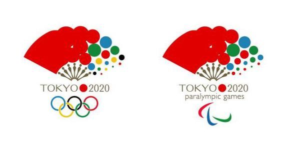
A Japanese graphic designer and percussionist who currently resides in Seville, Spain, has devised an alternate design to the officially selected 2020 Tokyo Olympics logo in light of the recent plagiarism scandal.
Fan reaction to his creation has been incredibly positive, to the point where many people are asking, “Can we please make this a reality?”
The saga of the 2020 Tokyo Olympics logo has become unexpectedly convoluted over the past several months. The original logo while Tokyo was a candidate city featured a colorful wreath of cherry blossoms, and was well received by the public. In stark contrast, the recently revealed official design has been met with lukewarm reaction, and many readers of our own site added their voices to those of on the disappointed masses in Japan. The emblem’s designer, Kenjiro Sano, has also recently come under fire after claims of plagiarism emerged.
In light of the plagiarism claims, many artists have been resubmitting their ideas for alternate ideas to the winning design. One such displeased artist, Japanese Twitter user @vivakankan, has come up with an idea which has very much struck a chord with the Japanese public.
Here’s what he has to say about his proposed Olympics emblem: “The folding fan symbolizes good omens in the way it spreads out, and the tool has been used to cheer others on since ancient times. I believe it’s the best design for an Olympic motif and it perfectly captures the Olympic quality of harmony. The theme of ‘Japan (the red suns) being supported by many peoples’ is also represented in its design.”
Japanese Internet user reactions were quite favorable to @vivakankan’s design, and shared their delight online:
“It’s unexpectedly good. Let’s go with it!”
“If they printed it on real folding fans it could become official Olympic merchandise (・∀・)”
“It’s simple, easy to understand, and vivid. This is definitely the better design!”
“You can instantly tell it’s Japan when mixed in with a bunch of other past Olympic logos.”
“I really like it, but I wish it were a bit more colorful on the left side.”
“This is way better than Sano’s funeral-like design. Do they really intend to go through with it, even though he ripped it off?”
Source: Biglobe News
Read more stories from RocketNews24. -- Is there an adorably chubby bird hiding inside the Tokyo Olympics logo? -- Karate’s long fight to make the 2020 Tokyo Olympic Games -- Could the 2020 Tokyo Olympics logo possibly be plagiarized?
© Japan Today Take our user survey and make your voice heard.











51 Comments
Login to comment
Tamarama
Thumbs up from me.
Imelda J. Domingo
Instead of circle design at the right side why not cherry blossoms? It resembles Japan and everybody loves cherry blossoms. Imelda
Michael Lam
この代替案は、2020年の東京オリンピックスタジアムのためだけでなく、日本国民、世界の人々のために作られました。
是非ご覧頂き、もしこの提案を支持して下さる場合は『いいね』をお願いいたします。
This alternative proposal was created for the 2020 Tokyo Olympic Stadium and more importantly the people of Japan and the world. Please have a look and like the page if you support the idea.
https://www.facebook.com/pages/Tokyo2020-Olympic-Stadium-Proposal/381935252005134
paulinusa
Very nice but can an obscure overseas Japanese designer really succeed? He may have popular support but does he have the necessary political connections.
igloobuyer
Looks like the 'Female Olympics' symbol to me. How about something more 'sporty' than a pink fan?
Raymond Chuang
It may not be perfect, but the proposed logo is certainly a lot better than an expensive plagiarism lawsuit.
zones2surf
Not bad. Much better than what was selected.
Or, alternatively, they could go retro. Recycle the '64 Olympic logo and just change it to 2020. The '64 logo was clean, simplistically modern.
http://www.ucreative.com/articles/the-tokyo-2020-olympics-logo-unveils-to-mixed-reviews/
kwatt
Kenjiro Sano does not look like graphic designer but is a businessman. So his head looks like pumpkin.
Furan
igloo seems to never have seen a man with a folding fan before. I approve nevertheless.
Tokiyo
igloobuyer: What have you got against women? Reign that machismo in a few notches.
wontond
Not bad. Definitely better than the generic "T" design they have now. I wish they would have riffed off the original cherry blossom design they used when they were just a candidate city.
WilliB
Fwiw, I approve it.
Jason Lovelace
I, personally, think these look better than the previous, Gothic-looking ones posted some time ago.
Just me two yens' worth...
papigiulio
Nice, do it, and get working on the new stadium ideas. Not much time left.
Schopenhauer
This is wonderful! Plagirism is a national disgrace.
GW
Light years better that the copied one! Do it!
Jeff Ogrisseg
A much, much, much better logo. Flush that clown Sano's hideous "design" down the crapper.
sf2k
I'm a fan
LFRAgain
The fan is infinitely better than the original one. It says Japan in a modern, playful way that utilizes an almost universally recognized symbol of Japanese culture. Use it! :-)
HongoTAFEinmate
Perhaps a bit kitsch but definitely an improvement on previous attempts whose originality was debatable. Let's hope that somebody, anybody, can come up with something that showcases the event and overcomes the recent teething problems.
therougou
Yeh, there wasn't even a real vote for the current funeral design, it was just decided based on connections. The thought of how much money Sano's company will rake in for that rip-off is just sickening.
gogogo
Love the design but the government won't allow the people to tell them what to do so they'll ignore this :(
katsu78
I haven't seen enough evidence to believe the current logo was truly plagiarized, after all there are only so many designs you can come up with using a serif T and a red circle. But that said, the current logo is a bit too hoity-toity for the Olympics. It's the kind of logo you'd expect to see hanging from a banner at your local art museum or in the New Yorker or, well, at a theater. It's minimalist, abstract, and vague, and while these aren't bad qualities, they aren't exactly popular qualities.
This new one though, I'd say it's pretty much perfect. Gets the idea across using simple imagery, and there's not a single person for whom it flies over their head. The only question is, can it be adopted? Because adopting it would mean the current Tokyo committee would have to admit they screwed up. And given how they're already in deep trouble screwing up with the stadium, admitting to another screw-up might just be one step too far for their egos.
kyushubill
Much better, hope the JOC goes for it. Bearing in mind tooth sucking geezers will hold meeting after meeting that will probably end in them deciding to keep the current one to avoid any idea of "responsibility" for plagiarism. They already have said "It is unfortunate that there is an accusation of plagiarism", this kind of statement usually means nothing will change.
gabrial888
Get rid of the plagiarism tainted logo already especially when the designer is embroiled in other allegations and he admitted to his "staff members'" wrongdoings. He's credibility is now zero and character is in question for passing the buck to his staff.
johninjapan
Much better than the T-L logo now being used. What does the 'L' stand for?
Disillusioned
Yeah, well, it does reflect on Japan's culture much better than the other copied one. However, I do agree it seems a tad feminine.
ArtistAtLarge
Very classy. Looks great.
sighclops
Olympic fatigue is already kicking in and we're still in 2015...
Maria M
Yes, please, this is a beautiful logo! (And also perfect for summer merchandise.) It's fun and has an all-ages appeal, unlike the stiff monochromatic "T" that appeals to the obvious 70 y/os that chose it.
Antony De Day
Ah...........much, much more aesthetically pleasing. It also feels soothing to my eyes as well, lol.
shanabelle
This is much better than Sano's plagarised piece. That thing looks like something the crew of the death star would wear.
bruinfan
I like it and at least it is her own design.
Yardley
I like this much better, but can anyone tell me why the Paralympics always have to have a different logo? Why can't they use the same logo? Is it just "tradition"? Just wondering...
therougou
Except that the original logo was actually a T and an L combined, and it makes no sense why Sano would include an L if he really came up with it on his own. Not to mention all of the other designs surfacing that looked like they were copied, and the Suntory one he already admitted his team "traced" (and put the blame on his employees instead of taking responsibility).
And then there is the website he stole ideas from and claimed he didn't visit, despite the fact he had an account there (which he quickly closed). The guy is Samuragochi part II at best.
smithinjapan
I like it. It's not a very simple idea, and is a little flashy, but I think it has a nice feel to it and a good symmetry. Certainly beats Mr. Plagiarism's emblem.
therougou: "And then there is the website he stole ideas from and claimed he didn't visit, despite the fact he had an account there (which he quickly closed). The guy is Samuragochi part II at best."
No kidding! Did you see that he also copied the zoo emblem from Costa Rica for the Higashiyama Zoo? The guy is pathetic.
igloobuyer
TokiyoAUG. 24, 2015 - 08:36AM JST igloobuyer: What have you got against women? Reign that machismo in a few notches.
I love women, but I thought the Olympics was for both genders.
nath
Fans like the one in the logo are for both genders, so it's not clear to what you are referring here.
igloobuyer
I like the design, just saying it looks a bit feminine, don't you think?
nath
No, not really.
Kenny Iyekawa
Love it!
kcjapan
“It’s unexpectedly good. Let’s go with it!”
SumoBob
This design makes a lot of sensu.
Tessa
It's nice, but I like the cherry blossoms best. Folding fans aren't exclusive to Japan, after all.
igloobuyer
Drag queen Olympics 2020, yay!
smithinjapan
Tessa: "Folding fans aren't exclusive to Japan, after all."
Neither are cherry blossoms, though many here like to think they are. In fact, the cherry blossom is native to the Himalayas. True that many people associate it with Japan in the Western world, but still. Contrary to this the folding fan is believed to be originally from Japan, based on Japan's earlier paper technology, and the oldest existing fan having been found in Nara.
In any case, the cherry blossom is FAR too overdone. This is somewhat refreshing, I think.
My guess is, though, that unless some major lawsuit goes against Sano in the near future, the JOC will stick to the decided emblem solely out of pride and statements that "Sano did not plagiarize" and "it's not a problem because there is no trademark on the Belgian logo!", despite the fact that clearly Sano DID plagiarize, because they couldn't save face. Especially after already backtracking on the stadium!
OldHawk
Much better. Make it so.
toshiko
The right side color should satisfy both gender. Cherry? Pink on red color?
Wolfpack
I like it. The current design is awful. Dump it now and go with something like this.
FizzBit
Much much better than the corporate logo they are going with.